
![]() Image author: Ted Eytan, Creative Common Licence
Image author: Ted Eytan, Creative Common Licence
About this tutorial
Open data is about transparency, accountability and empowerment. By making accessible the data they collect - those data points that can be shared without harming data subjects - organizations provide information to the public but also opportunities to build systems and applications that consume data, transform it, re-purpose it and eventually make it even more useful for society. Read more about Microsoft’s contribution and our Open Data Campaign.
*For more an quick introduction to this tutorial watch this short video explaining the project
Table of content
- Introduction
- 1. American Community Survey API endpoint
- 2. Example of query using Python
- 3. Example of query using JavaScript
Introduction
Why using an API? APIs allow to programmatically access remote data sources. When plugging a table, a chart or a web page to remote data sources, your data points are always up-to-date. APIs are often associated with databases too large to easily navigate them via a spreadsheet. If you don’t want to download the entire database to access just a few data points, what you need is a query. You can then adapt to users’ data needs by customizing your query and have this information rendered the most efficient and compelling way possible.
In this tutorial, I’m going to present one of the most insightful sources of data to understand racial inequality in the United States. I’ll provide tips to leverage its API - i.e. way to programmatically query the database. I will also provide examples of data visualizations and simple applications we can build on the top of the database. I will provide snippets of Python code and JavaScript. I will use Microsoft PowerBI, Highcharts and d3.js to visualize this information and reveal some of the insights hidden in this very rich dataset.
To easily share JavaScript code, I’ll use JSfiddle.
About U.S. Census Bureau’s American Community Survey (ACS)
As put by the U.S. Census Bureau, “the American Community Survey (ACS) is an ongoing survey that provides vital information on a yearly basis about our nation and its people. Information from the survey generates data that help determine how more than $675 billion in federal and state funds are distributed each year. Through the ACS, we know more about jobs and occupations, educational attainment, veterans, whether people own or rent their homes, and other topics. Public officials, planners, and entrepreneurs use this information to assess the past and plan the future” Read more about it on ACS web page.
Resources
- Web page of the American Community Survey
- ACS API Handbook, 2020, U.S. Census Bureau
- Using the Census API with the American Community Survey
- Developper section of the American Community Survey web page
- Census Bureau API key registration page
- The Open Data Institute
- Microsoft Open Data Campaign: Closing the data divide: the need for open data
- Microsoft’s Open Data Campaign: Exploring the power of open data
- Python resources:
- JavaScript resources: W3 schools JavaScript tutorial
- HTML resources: W3 schools HTML tutorial
1. American Community Survey API endpoint
An endpoint is simply the base url of an API. It contains the necessary information for the database to respond with the exact data points user want.
Let’s start with a data request example:
“https://api.census.gov/data/2018/acs/acs1/spp?get=NAME,S0201_308E&for=state:*”
The API will respond an array of arrays like this - nb. we truncated the response to save space:
[["NAME","S0201_308E","state"],
["Minnesota","86.8","27"],
["Mississippi","76.3","28"],
["Missouri","82.9","29"],
["Montana","83.6","30"],
["Nebraska","85.7","31"],
["Nevada","85.9","32"],
["New Hampshire","89.1","33"],
...
["Kentucky","81.7","21"],
["Louisiana","78.1","22"],
["Michigan","84.1","26"]]
The first element of one of the nested arrays is the geography NAME (here the names of the States), the second is the value of the requested indicator (here S0201_308E which is the code for Household with a broadband internet subscription), finally the last element is the State code used by the census bureau.
Let’s look at url parameters in details:
- Here is the API endpoint:
https://api.census.gov/- NB. API url with no parameter. - In this example we request the 2018 ACS survey:
data/2018/acs/acs1/
And now we can define our parameters (using spp?get= as a prefix):
NAMEwill allow us to have the actual name of the geography displayed on the top of the geography code.- indicator code :
S0201_308E(which correspond to “COMPUTERS AND INTERNET USE!!Total households!!With a broadband Internet subscription”) - geography: all states
state:*(Note that:*stands for “all” in “all states” ) - Note that between each parameter the
&operator is added. We can also use,to add several of the same entity for e.g.:S0201_307E,S0201_308E,S0201_246E
In this tutorial we want to take advantage of the detailed data for population group (“Black and African American, White, Hispanic or Latino”, etc.).
The parameter POPGROUP allow querying by population groups. Here are some examples of population group codes:
- “001”: “Total population”
- “451”: “White alone, not Hispanic or Latino”
- “400”: “Hispanic or Latino (of any race) (200-299)”
- “453”: “Black or African American alone, not Hispanic or Latino”
- “457”: “Asian alone, not Hispanic or Latino”
- More info about available population groups (“Race/Ethnic Group”): here
Many indicators are available in the survey, here is a list for the 2019 ACS: https://api.census.gov/data/2019/acs/acs1/spp/variables.html.
Results are available for several geography levels (States, congressional district, county, metropolitan areas, etc.). Here is the list of available geography level for the 2019 ACS.To make it easier, you will find the metropolitan areas available with their codes here.
As an example, here is how to get the total population for Alameda County (code 001) in the state of California (state code 06) for the ACS 2019: https://api.census.gov/data/2019/pep/population?get=NAME,POP&for=county:001&in=state:06
More information about codes for states, county, population groups etc. are available on the ACS web page, we encourage you to search for them.
Finally, if you want to make many requests to the API (More than 500 queries per IP address per day), you will need to get an API key - it’s free.
To use your API key, just add the parameter &key= - followed by your api key - at the end of your query.
</a>
2. Example of query using Python
You now have a better understanding of the way the American Community Survey’s API works. Let’s put this into practice writting some code in Python.
In the following script I’ll query the API, store the data into a Pandas dataframe and finally present some findings in a bar chart using Matplotlib. The data point we will request is “Total households with a broadband subscription” (code S0201_308E)
NB. The code is commented so that non-coders can follow it, step by step.
import pandas as pd
import requests
import json

# API given by US census bureau
api_key=""

# here we chose "Total households with a broadband subscription which code is S0201_308E
indicator="S0201_308E"

# we want Total population, white, Black or African American and Hispanic or Latino
popgroup1="001" # Total population
popgroup2="451" # "White alone, not Hispanic or Latino"
popgroup3="453" # "Black or African American alone, not Hispanic or Latino"
popgroup4="400" # "Hispanic or Latino (of any race) (200-299)"

# here is the geography level : Metropolitan statistical area and micropolitan area
# reference: https://www.census.gov/programs-surveys/metro-micro/about.html
geo="metropolitan%20statistical%20area/micropolitan%20statistical%20area:*"

# endpoint of the API
url="https://api.census.gov/data/2018/acs/acs1/spp?get=NAME,"+indicator+"&for="+geo+"&POPGROUP="+popgroup1+"&POPGROUP="+popgroup2+"&POPGROUP="+popgroup3+"&POPGROUP="+popgroup4+"&key="+api_key
print(url)

response = requests.get(url)
data = json.loads(response.text)

# Save a Pandas DataFrame
df=pd.DataFrame(data[1:], columns=data[0])
# values are stored as string, we need to convert them into numbers
df[indicator]=df[indicator].astype(float)

#save as csv
df.to_csv('ACS_broadband.csv')

#display table sorted by metro area
df.sort_values(["NAME"])
[https://api.census.gov/data/2018/acs/acs1/spp?get=NAME,S0201_308E&for=metropolitan%20statistical%20area/micropolitan%20statistical%20area:&POPGROUP=001&POPGROUP=451&POPGROUP=453&POPGROUP=400](https://api.census.gov/data/2018/acs/acs1/spp?get=NAME,S0201_308E&for=metropolitan%20statistical%20area/micropolitan%20statistical%20area:&POPGROUP=001&POPGROUP=451&POPGROUP=453&POPGROUP=400)
| NAME | S0201_308E | POPGROUP | metropolitan statistical area/micropolitan statistical area | |
|---|---|---|---|---|
| 0 | Akron, OH Metro Area | 86.0 | 001 | 10420 |
| 292 | Akron, OH Metro Area | 80.5 | 453 | 10420 |
| 186 | Akron, OH Metro Area | 86.9 | 451 | 10420 |
| 293 | Albany-Schenectady-Troy, NY Metro Area | 78.0 | 453 | 10580 |
| 187 | Albany-Schenectady-Troy, NY Metro Area | 87.5 | 451 | 10580 |
| ... | ... | ... | ... | ... |
| 105 | Worcester, MA-CT Metro Area | 87.9 | 001 | 49340 |
| 185 | Worcester, MA-CT Metro Area | 83.8 | 400 | 49340 |
| 290 | Worcester, MA-CT Metro Area | 87.8 | 451 | 49340 |
| 291 | Youngstown-Warren-Boardman, OH-PA Metro Area | 82.0 | 451 | 49660 |
| 106 | Youngstown-Warren-Boardman, OH-PA Metro Area | 81.8 | 001 | 49660 |
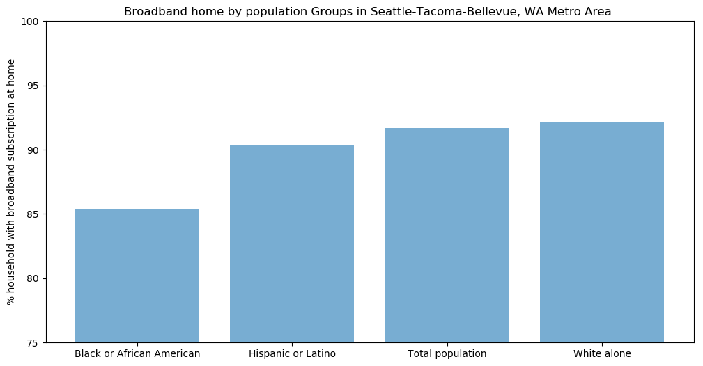
i. Data-visualization with Matplotlib
We can now display the data in a bar chart with Matplotlib.
Let’s dig into Seattle-Tacoma-Bellevue metro area
# let's get data for Seattle-Tacoma-Bellevue metro area
Seattle=df.loc[df["NAME"]=="Seattle-Tacoma-Bellevue, WA Metro Area"].copy()

# code and label for population group
pop_group_dict={"001": "Total population",
                "451": "White alone, not Hispanic or Latino",
                "400": "Hispanic or Latino (of any race) (200-299)",
                "453": "Black or African American alone, not Hispanic or Latino",
                "457": "Asian alone, not Hispanic or Latino"}


Seattle["Population group"]=Seattle["POPGROUP"].map(pop_group_dict)
Seattle=Seattle.sort_values("S0201_308E")
Seattle
| NAME | S0201_308E | POPGROUP | metropolitan statistical area/micropolitan statistical area | Population group | |
|---|---|---|---|---|---|
| 356 | Seattle-Tacoma-Bellevue, WA Metro Area | 85.3 | 453 | 42660 | Black or African American alone, not Hispanic ... |
| 174 | Seattle-Tacoma-Bellevue, WA Metro Area | 90.4 | 400 | 42660 | Hispanic or Latino (of any race) (200-299) |
| 91 | Seattle-Tacoma-Bellevue, WA Metro Area | 91.7 | 001 | 42660 | Total population |
| 276 | Seattle-Tacoma-Bellevue, WA Metro Area | 92.1 | 451 | 42660 | White alone, not Hispanic or Latino |
Now we have the subset for Seattle-Tacoma-Bellevue metro area, we can draw a bar chart with matplotlib
import matplotlib.pyplot as plt; plt.rcdefaults()
import numpy as np

plt.figure(figsize=(12,6))
pop_groups = Seattle["Population group"].tolist()
y_pos = np.arange(len(pop_groups))
broadband_home =Seattle["S0201_308E"].tolist()
plt.bar(y_pos, broadband_home, align='center', alpha=0.6)
plt.xticks(y_pos, pop_groups)
plt.ylabel('% household with broadband subscription at home')
plt.title('Broadband home by population Groups in Seattle-Tacoma-Bellevue, WA Metro Area ')
plt.ylim(75,100)
plt.show()
The complete Python script is available here.
ii. Data visualization using Microsoft PowerBI
As another example of visualization, we showcase below what can be easily achieved by less advanced coders using Microsoft PowerBI. PowerBI allows to build dahsboards in minutes when you would need hours or days to code it from scratch. We used the same indicator as the python query example. The CSV file is stored in this GitHub repo and accessible here. NB. The data source for this PowerBi visualization is the one hosted in this repo as PowerBI can easly connect to remote data sources.
3. Example of query using JavaScript
Let’s continue our journey with JavaScript. If you want to build a web application the standard way is to use JavaScript and HTML/CSS. I will start with a simple query
asking the API for poverty rate (code: S0201_255E) for “New York-Newark-Jersey City, NY-NJ-PA Metro Area” which code is 35620 (see full list) for Total population (code 001) AND for Black or African American (code 004)
NB. Code “004” is the code for all Black and African American, including Hispanic or Latino.
Here is our new query: https://api.census.gov/data/2018/acs/acs1/spp?get=NAME,S0201_246E&POPGROUP=001&POPGROUP=004&for=metropolitan%20statistical%20area/micropolitan%20statistical%20area:35620
The API response is now:
[["NAME","S0201_246E","POPGROUP","metropolitan statistical area/micropolitan statistical area"],
["New York-Newark-Jersey City, NY-NJ-PA Metro Area","9.4","001","35620"],
["New York-Newark-Jersey City, NY-NJ-PA Metro Area","15.1","004","35620"]]
We end up with an array of 3 arrays. The first one provides the meta data, the second one gives poverty rate for total population (i.e. 9.4%) and the third one for Black or African American (15,1%).
To retrieve and store this information in variables, we can use those elements’ index - NB. index starts with 0 not 1. Array[0] will be the 1st array containing the meta data ["NAME","S0201_246E","POPGROUP","metropolitan statistical area/micropolitan statistical area"] and array[0][0] will be its 1st element if this first array, i.e. NAME.
To find the value of the poverty rate for total population (nb. population code “001”) you must dig into the 2nd array (i.e.[1]) and get its 2nd item ([1]): array[1][1] is the spot where poverty rate for total population is stored.
Let’s put that into practice and display this information on a web page:
$(function() {
  // query the API
  $.ajax({
    url: "https://api.census.gov/data/2018/acs/acs1/spp?get=NAME,S0201_246E&POPGROUP=001&POPGROUP=004&for=metropolitan%20statistical%20area/micropolitan%20statistical%20area:35620",
    complete: function(json) {

      // get the API response
      data = JSON.parse(json.responseText);

      // set some variable to host data:
      value_total = data[1][1]; // Poverty rate for total population
      value_b = data[2][1]; // Poverty rate for Black and African American
      metro = data[1][0]; // name of the metropolitan area

      // let's add some text to be displayed on the web page
      metro_text = "<b>Poverty rate in </b>" + metro
      total_text = "<b>Total population: </b>" + value_total
      black_african_american_text = "<b>Black or African American: </b>" + value_b

      // let's send this text to the actual web page
      document.getElementById("metropolitan").innerHTML = metro_text;
      document.getElementById("total_population").innerHTML = total_text;
      document.getElementById("black_african_american").innerHTML = black_african_american_text;
    }
  })
})
Complete code and results on JSfiddle:
i. Simple visualization with d3.js
d3 stands for Data-Driven Document, d3.js is an open source data visualization library. It is not the easiest to implement but it provides full flexibility. Here is an example of a simple bar chart rendering the previous API query.
ii. Your first application using Highcharts
When building a web application, what you try to achieve is to give users the freedom to choose what to display. Here, I will let the user select a metropolitan area and an indicator. Those 2 parameters will be used to build the API query (i.e. the url). Finally, the job will consist in parsing the resulting data points and use them as input for the chart - here Highchart’s Basic column chart.
In this example I use a dictionnary to store the values associated with their categories (i.e. population groups).
Here as well, the code is commented in the JavaScript tab of the JSfiddle below.
Conclusion
The American Community Survey is a rich dataset which provides much insight to understand racial inequalities in the United States. Scrolling-up and taking a closer look at those data points and charts you will get a first taste of this systemic or systematic inequalities. Although this tutorial focuses on the technical intricacies of leveraging APIs to fish data points, I hope journalists and data-journalists will find it useful to raise awareness on the fate of the Black or African American community, but also the Hispanic and Latino community in the U.S.
Exploring this dataset, you will find out that those 2 communities are almost systematically worse-off than the average population in the U.S. whether it is about income levels, poverty rate, access to education, but also digital - devices and broadband internet. We encourage, data-journalists, data-activists, policy makers to dig into the facts and help designing more inclusive policies.